

How to Choose the Right Paint Colors for Your Home
Paint feels like it should be one of the easier decisions in a room. It is relatively affordable, there are thousands of colors to choose from, and if you get it wrong, you can always repaint. Simple enough, right?
Except anyone who has stood in front of a wall covered in nearly identical paint samples knows that it rarely feels simple. A warm white saved from someone else's home can look yellow, gray, or slightly blue the moment it enters yours. Usually, the color has not failed us. We just have not accounted for the room around it, especially the light.
My general approach is to keep the main, connected areas of a home fairly light and neutral, then bring more personality into the secondary spaces. But before I choose either one, I look at the light. The direction your home faces, the amount of natural light a room receives, and even the time of day can completely change the way a color appears.
Before You Look at Paint, Look at the Room
Start with what is already there and what is staying. Flooring, countertops, tile, stone, cabinetry, large upholstery pieces, and rugs all have color, even when we call them neutral. They are also much more expensive and difficult to change than paint, so it makes sense to let them lead.
Look closely at their undertones. Does the wood floor lean orange, red, yellow, or more neutral? Does the stone have cream, blue-gray, taupe, or green running through it? You do not need the paint to match any of these things exactly. You are simply looking for enough of a relationship that everything feels like it belongs in the same room.
This is also why I rarely recommend choosing paint first during a renovation. We can mix paint in almost any direction. Tile, stone, flooring, and cabinetry give us far fewer options. Choose the less adaptable materials first, then use paint to connect them.
And while we are here, white is not automatically the safest choice. In a room without much natural light, a white can feel flat, cold, or unfinished. The right neutral might be a warm cream, a soft putty, a muted greige, or a subtle color that behaves like a neutral. Let the room tell you what it needs instead of defaulting to the color that seems least risky.
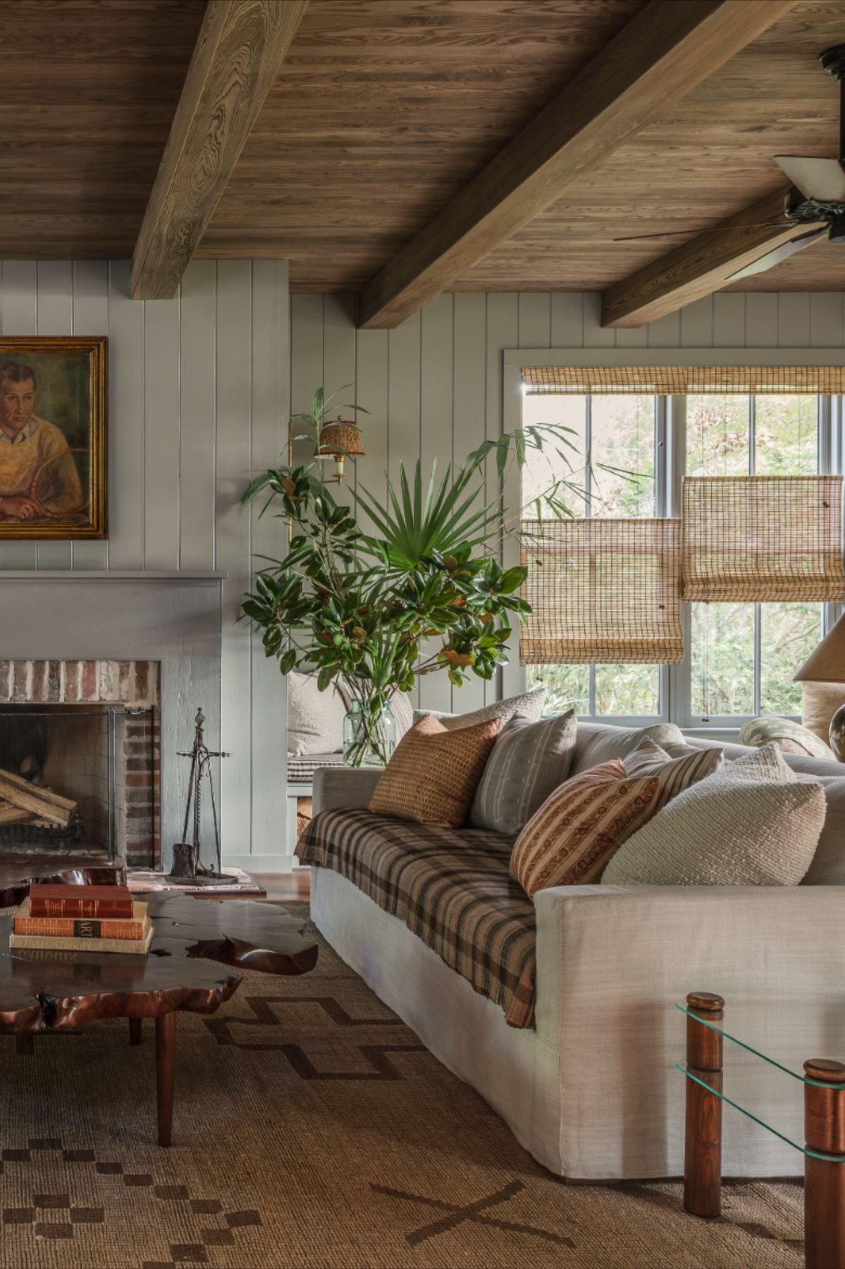
Design: Logan Killen
Let the Main Rooms Breathe
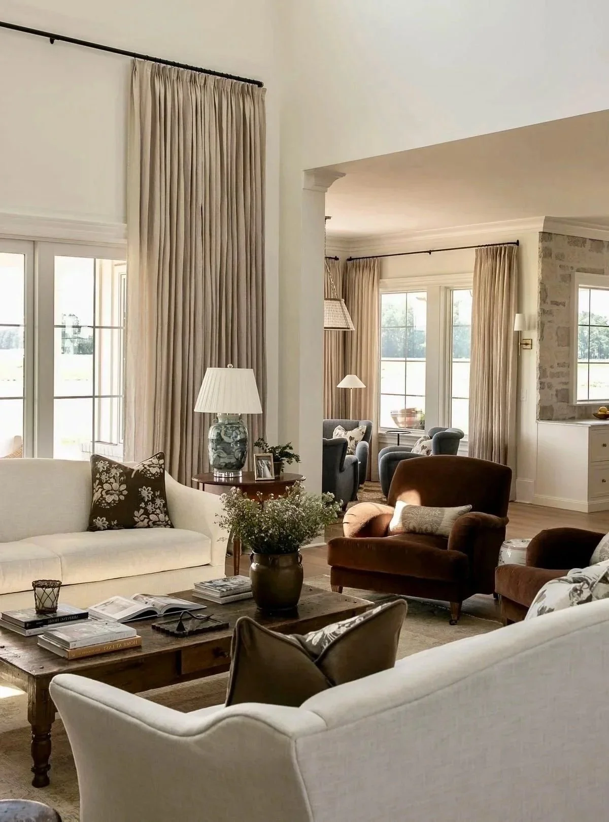
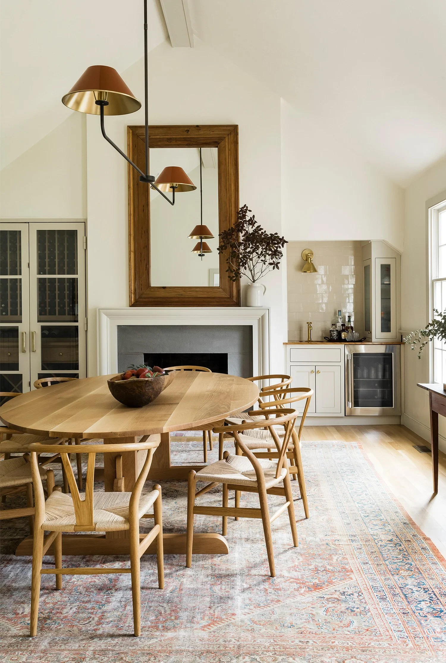
In the public areas of a home, I usually prefer to keep the palette fairly light and quiet. These are the rooms that tend to connect to one another, so a restrained backdrop helps the house flow and gives the materials, furnishings, art, and people room to stand out.
I do not want you to walk through an open living area and notice where one paint decision ends and another begins. I want the rooms to feel connected, even when each space has its own purpose and personality.
Where to Add Personality
The secondary spaces are where I like to have a little more fun.
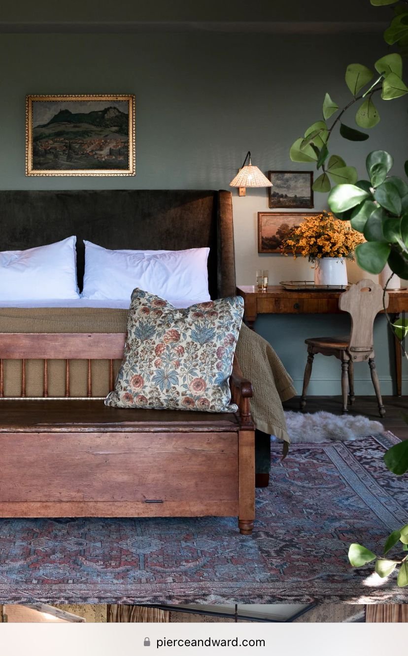
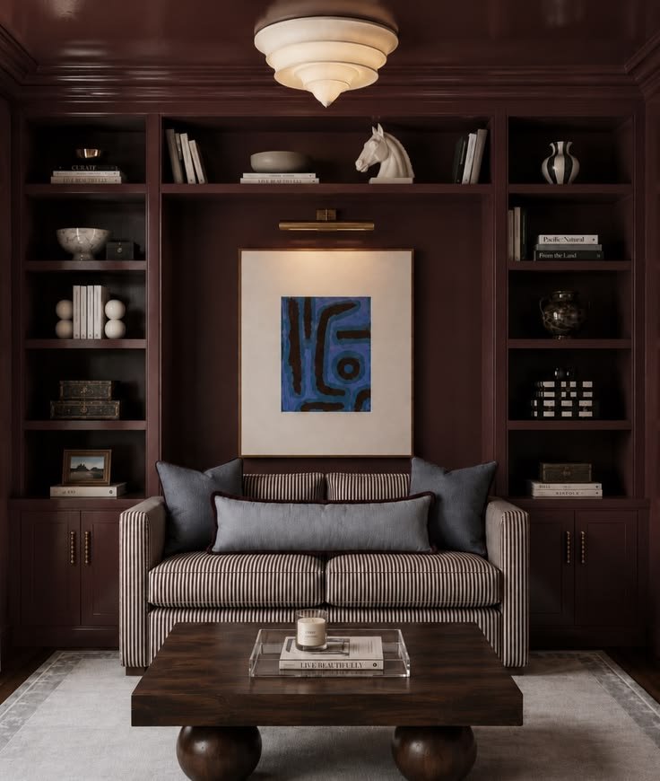
Powder rooms, offices, laundry rooms, bedrooms, mudrooms, and spaces tucked away from the main areas can usually carry more color, an interesting wallcovering, or a less expected paint treatment. Because these rooms are experienced more independently, they can have distinct personalities without making the whole house feel visually busy.
This might mean a rich office color, patterned wallcovering in a powder room, painted bedroom trim, or wrapping the walls and ceiling in the same shade. These smaller moments are often what make a home feel personal rather than a showroom.
I think of paint as an adaptable finish. It is not as fluid as a lamp, pillow, or piece of art, but it is far easier and less expensive to change than flooring, tile, cabinetry, stone, or millwork. That makes it one of the places where I encourage clients to take a fun risk. Repainting is still work, but it is not a forever decision. Our homes are allowed to evolve with us.
The Direction Your Windows Face Matters
This is one of the most important and simultaneously, most overlooked, things to think about before choosing any paint color. The direction a room faces changes the light, and the light changes the way we experience the color. The same sample can look warm and creamy in one room, cool and gray in another, and much more saturated in strong afternoon sun.
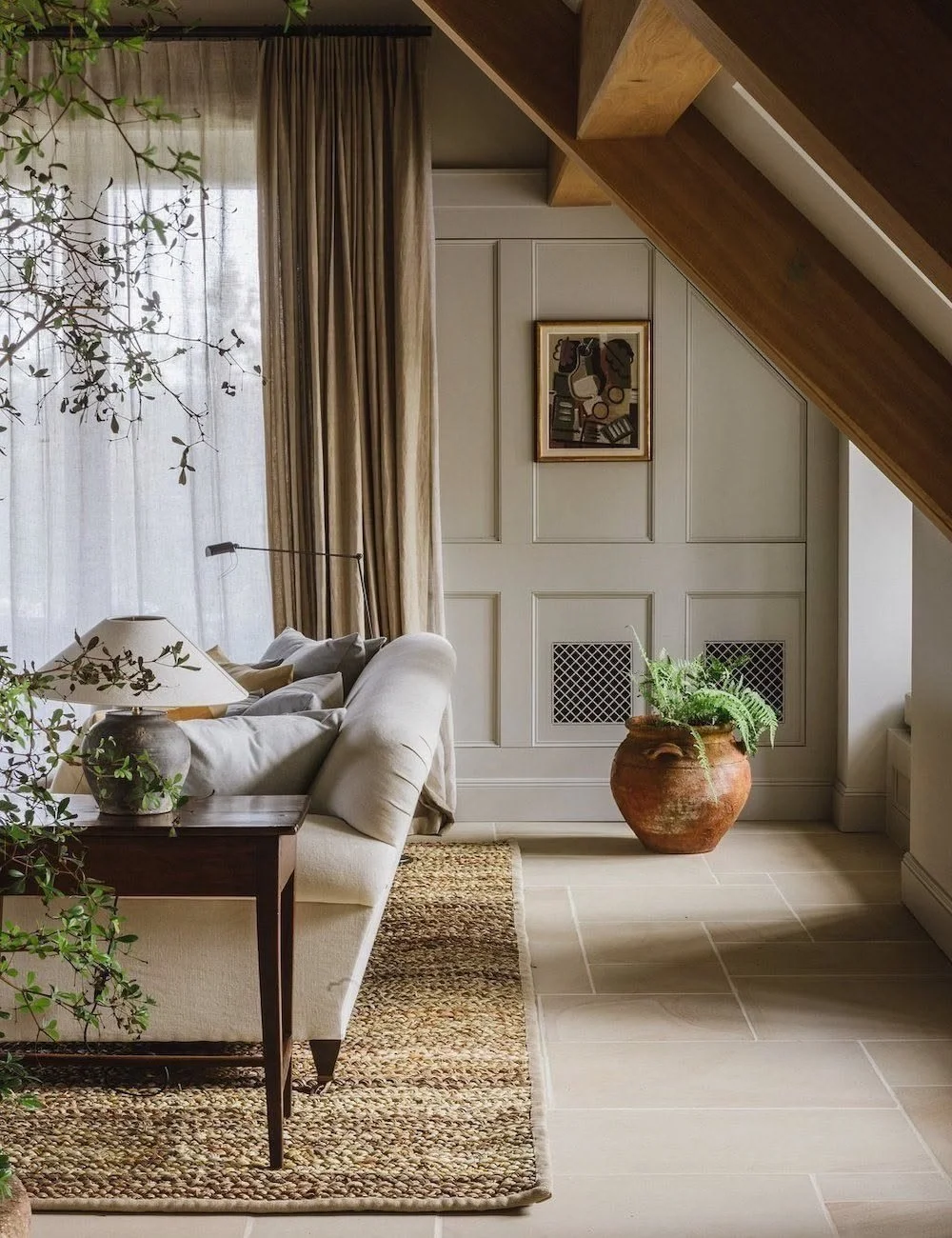
South-facing rooms can make creams and warm whites look more golden, while cooler blues, greens, and grays often feel softer and more balanced. North-facing rooms tend to do the opposite. A crisp white can take on a blue cast, and a pale gray may feel much colder than expected.
You can balance cool northern light with a warmer color, but you do not always have to fight it. Sometimes a lower-light room is at its best when you lean into the mood with a deeper blue, green, or complex neutral. A dim room does not automatically need white paint. A richer color can make it feel intentional rather than unsuccessfully brightened.
East- and west-facing rooms change more dramatically throughout the day, which is why it helps to think about when you actually use the space. A breakfast room and an evening den do not need to perform under the same light.
Direction is the starting point, but not the whole story. Window size, mature trees, roof overhangs, neighboring houses, and even the season can change the amount of light that reaches a room. Artificial light matters too, so make sure you like the color under your actual lamps and fixtures. Hint: Lighting should always be 2700K.
What About LRV?
When you look at the specifications for a paint color, you will usually see a number labeled LRV. It stands for Light Reflectance Value, and it tells us how much visible light that color reflects.
LRV is measured on a scale from 0 to 100. Colors near 0 absorb most of the light and appear very dark. Colors closer to 100 reflect more light and appear much lighter. The small paint chip does not always accurately show how light or dark a color will feel across four walls, so the number gives us another useful point of reference.
The important phrase is available light. A high-LRV color can reflect more of the light a room already has, but it cannot create natural light where there is none. A lower-LRV color in a bright south-facing room may look livelier and more saturated than the exact same color in a north-facing room.
LRV does not tell us anything about undertone either. Two colors can have nearly identical LRVs and still feel completely different because one leans warm and the other cool. Think of the number as helpful context, not a shortcut to the final answer.
Say goodbye to the Tiny Paint Chip
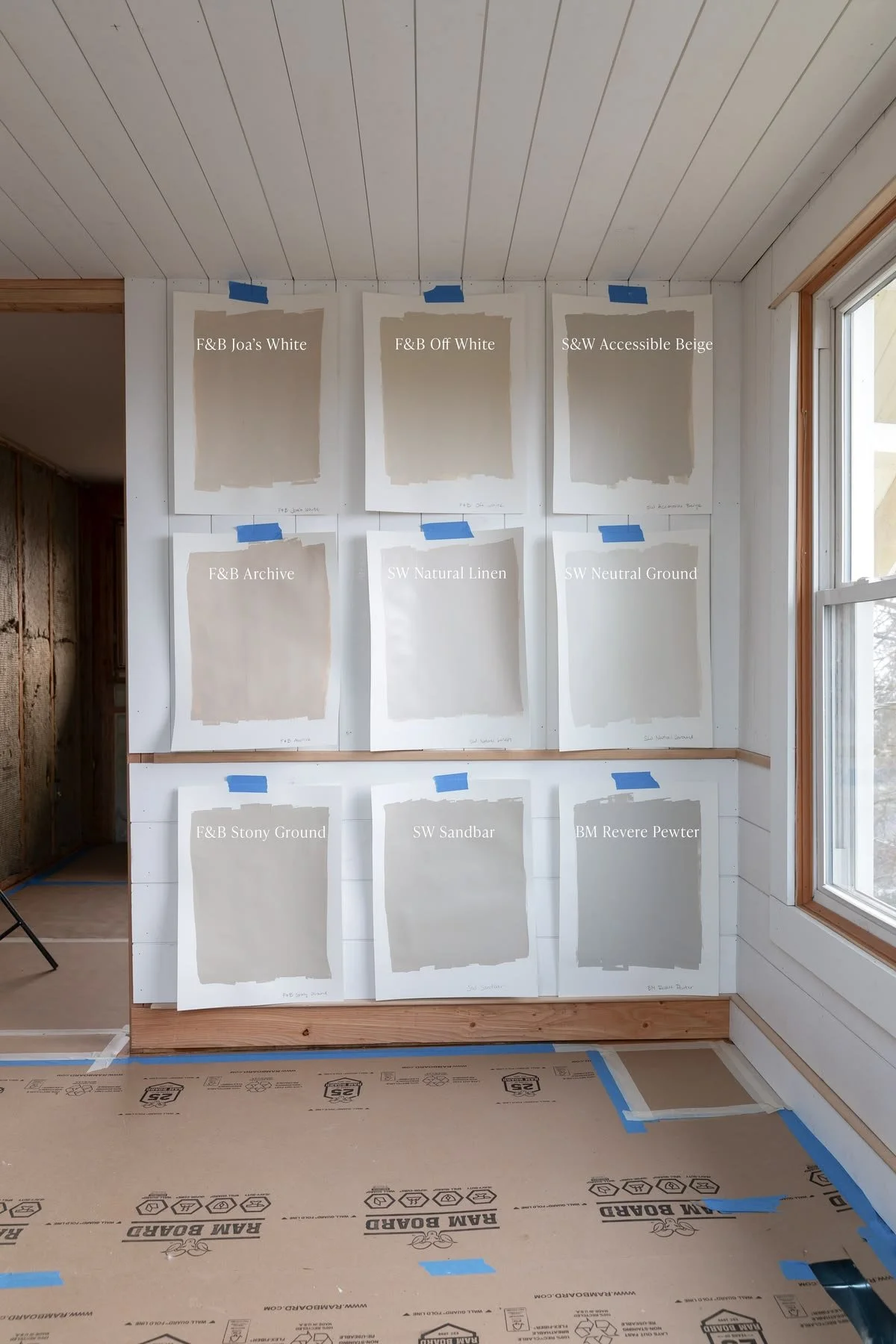
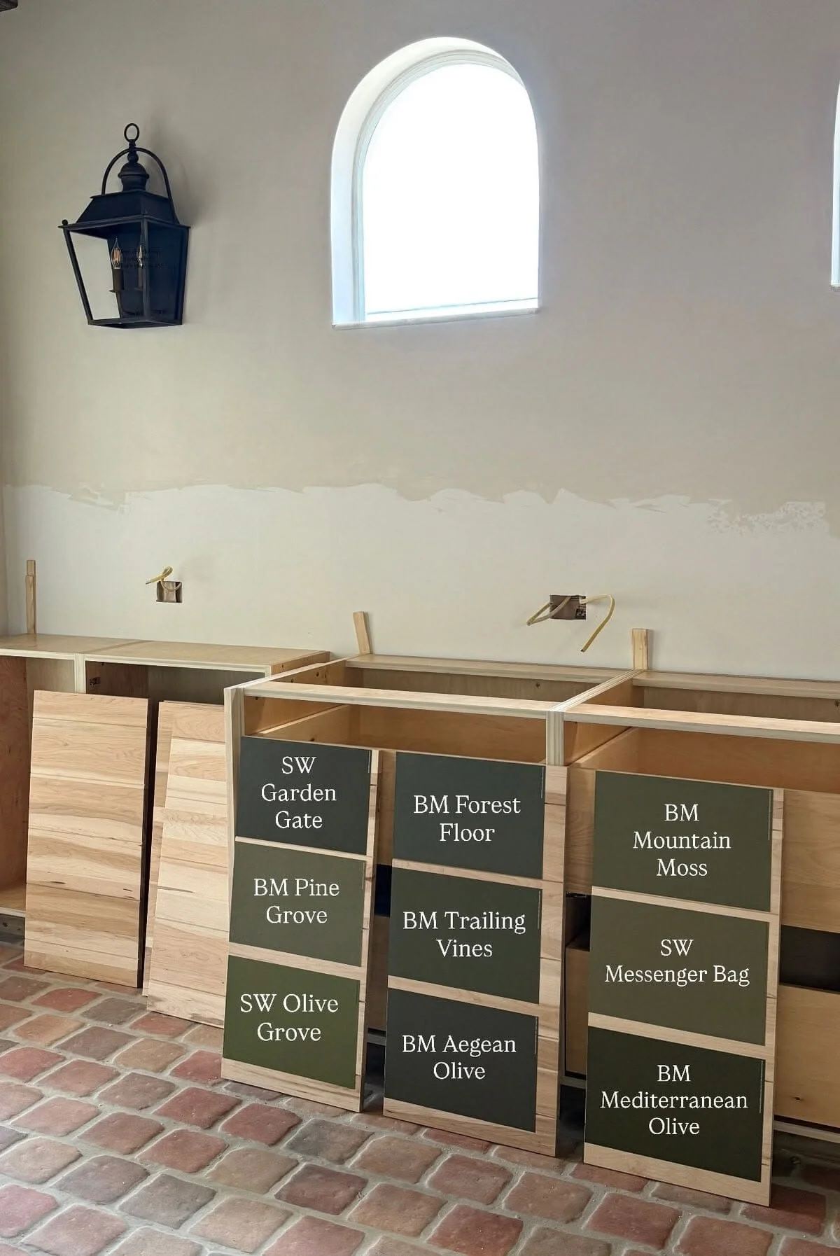
Once you have narrowed the options, test them at a meaningful scale. Paint large sample boards or use removable painted samples so you can move each color around the room. Place them near the flooring, trim, cabinetry, countertops, and upholstery. Look at them on more than one wall and at several times of day.
Keep the samples far enough apart that they are not visually blending together, and give yourself a few days before deciding. The right color is not always the one that makes the biggest first impression. It is often the one that continues to feel right as the light changes and you live around it for a while.
Source: Jenna Sue Design
At Some Point, You Just Have to Trust Yourself
Once you have paid attention to the light, worked with the finishes already in the room, and tested your samples properly, you have done the homework. At some point, you get to trust yourself and choose the color that makes you excited to walk into the room.
And if you eventually want something different, that is okay too. Paint is one of the easiest parts of a home to change. Your home is allowed to evolve, and your choices are allowed to evolve with it!
You Don’t Have to Figure It All Out Alone
Whether you need a little expert guidance or a partner to help bring the whole thing together, Murphy Lane Interiors offers thoughtful design support tailored to you, your home, and the way you want to live.
Explore Design Services